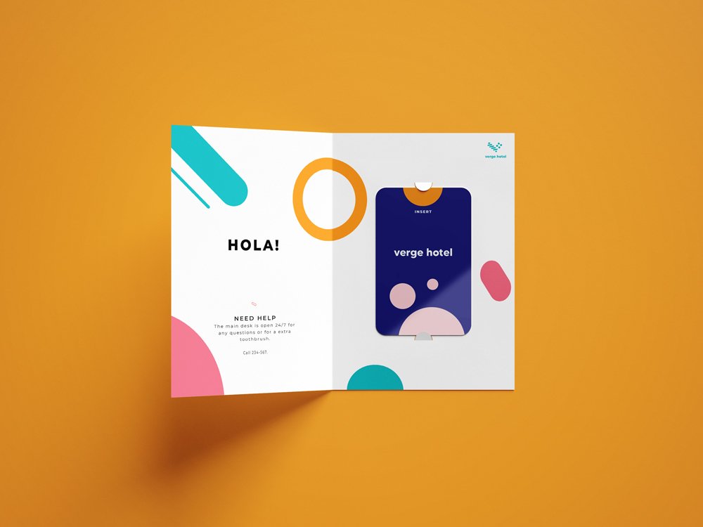
For the Modern traveler
Verge is an Boutique hotel located in the city for young travelers who are looking for local experiences and social experiences. It is a budget-friendly type of accommodation that is modern, luxurious, fun and stylish.
An important component of the brand identity was creating the hotel’s logo. Taking inspiration from the Bauhaus design, the logo took form. It has geometric shapes, san serif typography, and a bold color palette. You can see the same shapes from the logo in the brand identity but with different sizes, color and weights.

The journey starts with you
It all begins with you and in order to move forward with Verge's true personality, we needed some more info about you. We find that young millennials with creative minds are traveling more to find more about themselves. The quest to experience new cultures, budget friendly, and meet new people are a must-do! Staying at the right hotel is the beginning of that experience.
“Traveling locally but with style”

Colors
The brand colors are bright and popping colors to show the hotel’s emphasis on the experience and bring a fun approach to the hotel.
Graphic Elements
Verge’s graphic elements use rounded lines and circles with different sizes and weights. It is derived from the logo with its roundness and incorporating shapes.


Logo
The inspiration for the logo came from the Bauhaus geometric shapes and playing with that concept. The circles and the roundness can be seen in all design touchpoints such as the posters below.
“Modern, budget-friendly, local experience for Millennials”


