The Solomon R. Guggenheim Museum
The Solomon R.Guggenheim Museum wants to do a redesign of the existing logo and feel completely new. The project goal is to set a new tone for them but still have a connection to the museum.
The solution came from the creation of the logo first to build from the rest of the brand identity. The inspiration was the Guggenheim building itself. The logo conveys more movement and a refresh for digital and promotional material.

Logo Sketches
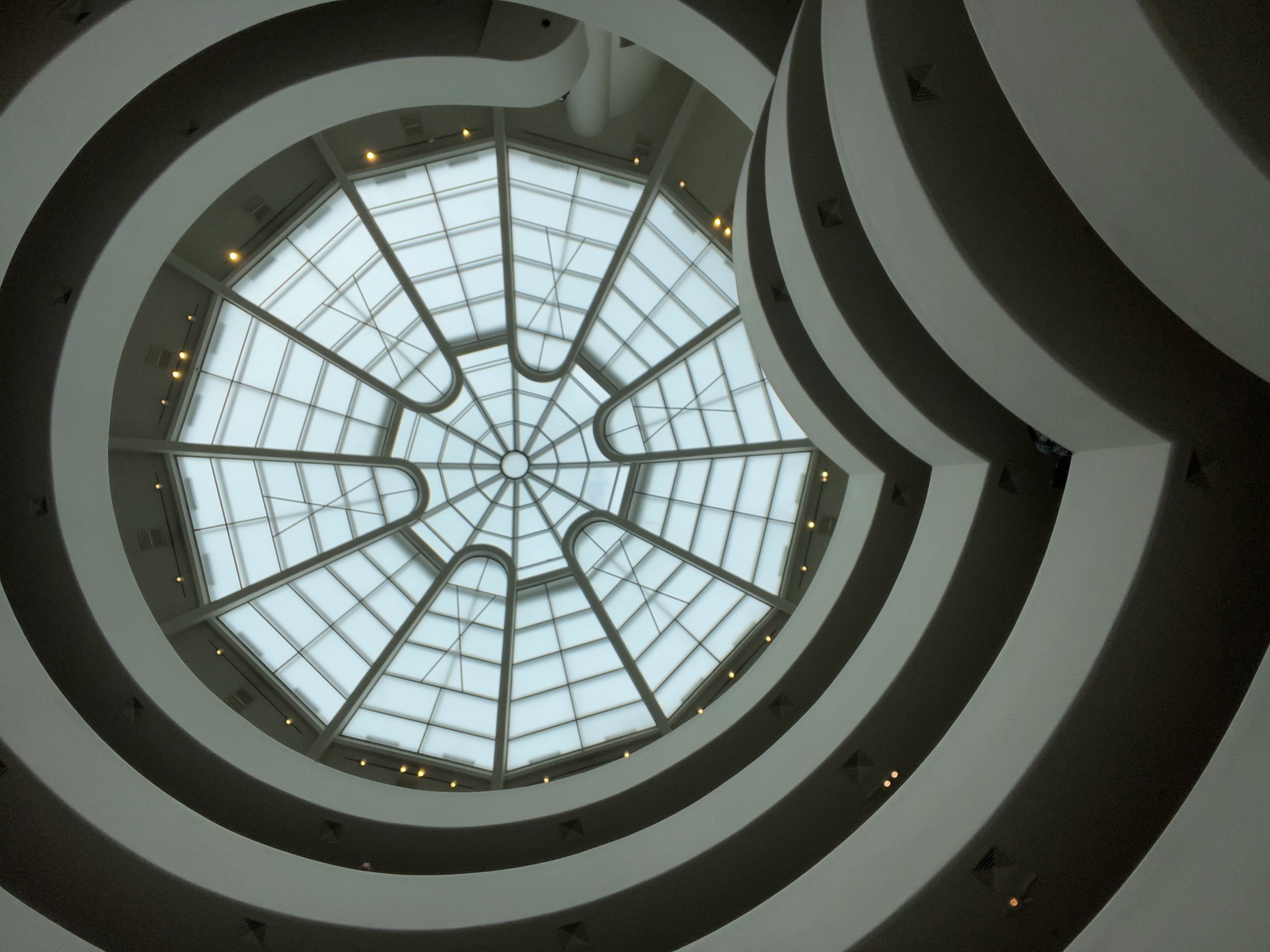
Researching the history of the building, the inspiration for the new logo came from architecture of the building or part of the blueprints and the work that it carries which is modern art. The new logo would be modernized to be best used in web and social applications.
Three Alternate Versions
As in the above sketches, you can see the logo inspiration comes from simplifying the view of the building from the outside, or from the inside of the building looking up towards the ceiling.
Before & After
Final Logo
From the first rendition, it was modified to be able to view the lines more and for the letter G to stand out in small print. It was also shortened to just the word Guggenheim and removed museum in the font Nobel.
Color
Since it is a redesign the color is to bring movement and be modern but appropriate for the art that it showcases.


